Munson is a world-class, multifaceted arts destination in Utica, New York, that boasts a vibrant campus and art collection to engage with their diverse community.
At Order, we developed a system that translates the institution’s archival design to their contemporary practice. Built from the foundation of a proprietary typographic system, the identity encompasses the expressive values of the Munson artistic community.
Munson
Munson (previously Munson-Williams-Proctor Arts Institute) was founded in 1919 and named for three generations of one family—Alfred Munson, his daughter Helen Munson Williams, and her children Rachel and Maria Williams Proctor.
Helen Munson Williams was a prolific 19th-century collector of decorative and fine arts. Her work collecting art during her lifetime — in large credit to the financial freedom of her parents Elizabeth and Alfred Munson — helped to establish the family's art collection. Rachel and Maria Williams Proctor and their husband, half bothers Frederick and Thomas, continued to collect and carry on the philanthropic community legacy.

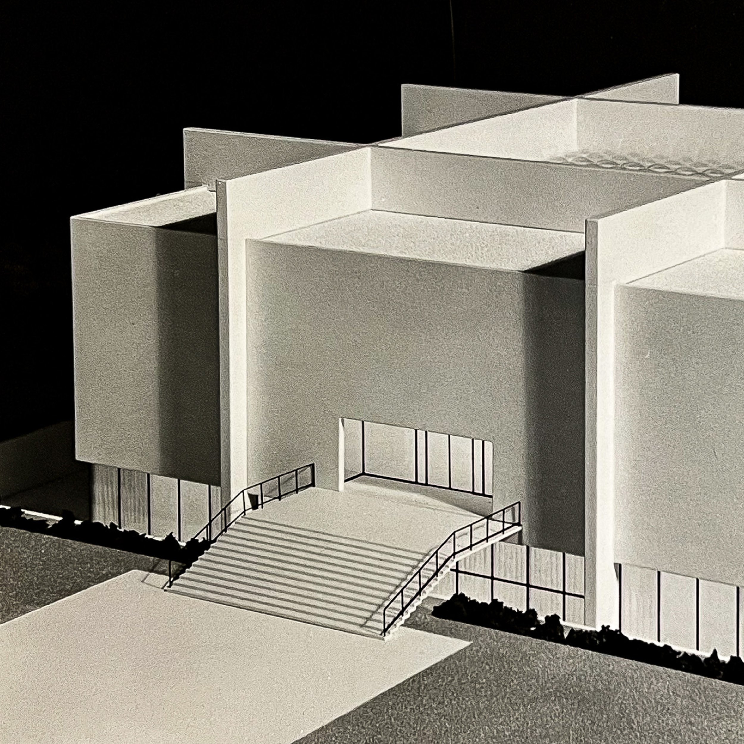

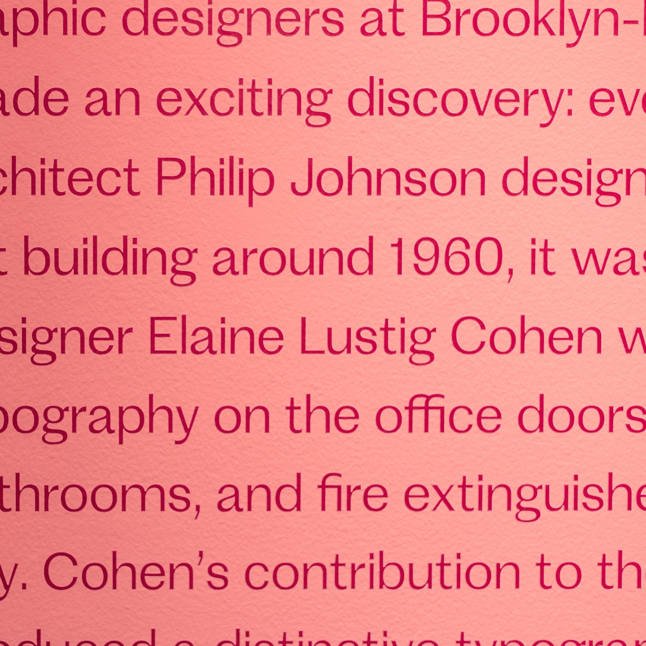
Renowned architect Philip Johnson designed the Museum of Art in an International-style gallery building.
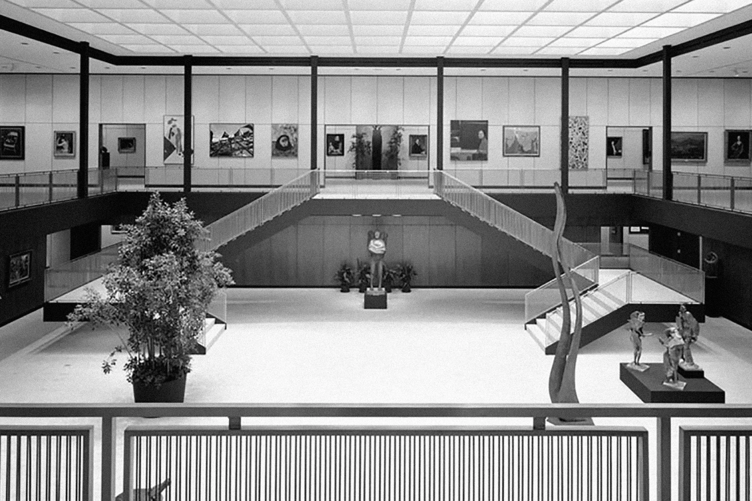
The Museum of Art features a renowned permanent collection, fascinating exhibitions, and overall diverse artistic genres.
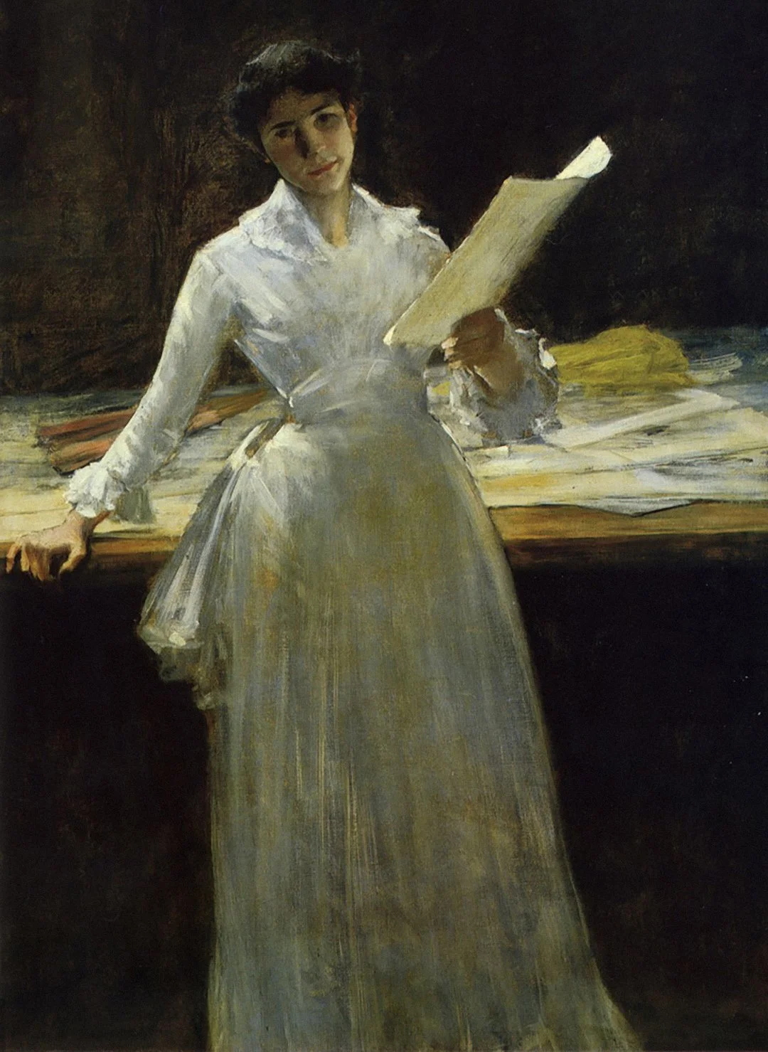
William Merritt Chase
Memories
1885-1886
Museum Purchase, 57.305
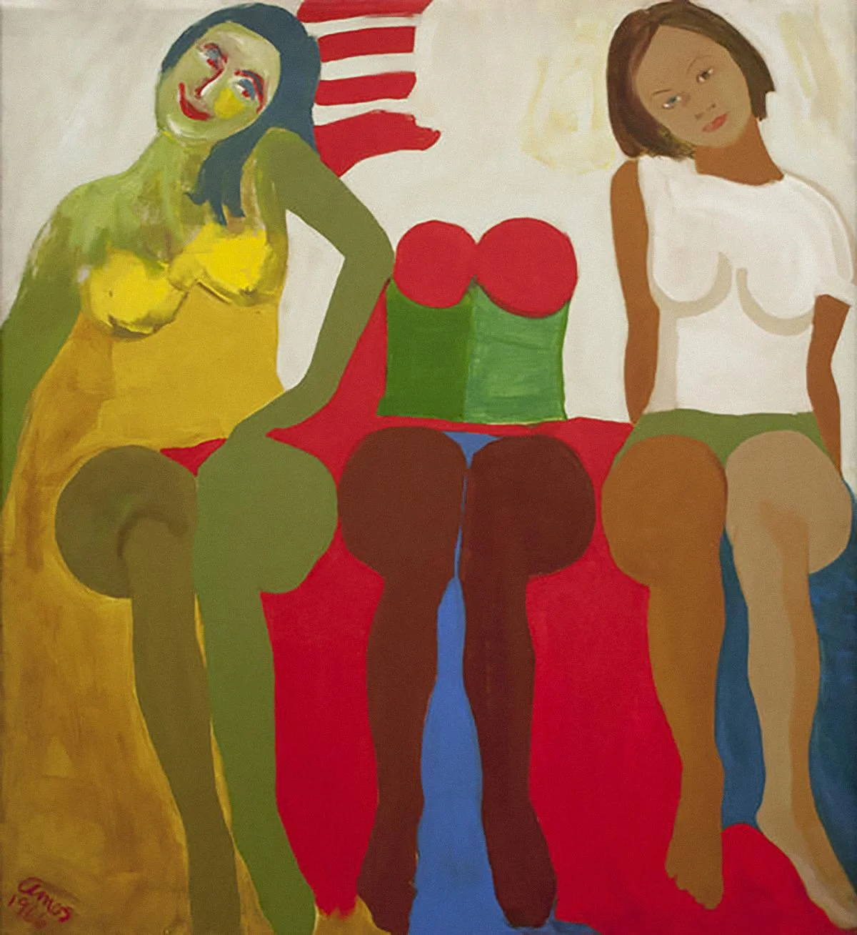
Emma Amos
Godzilla
1966
Museum Purchase, 2016.5
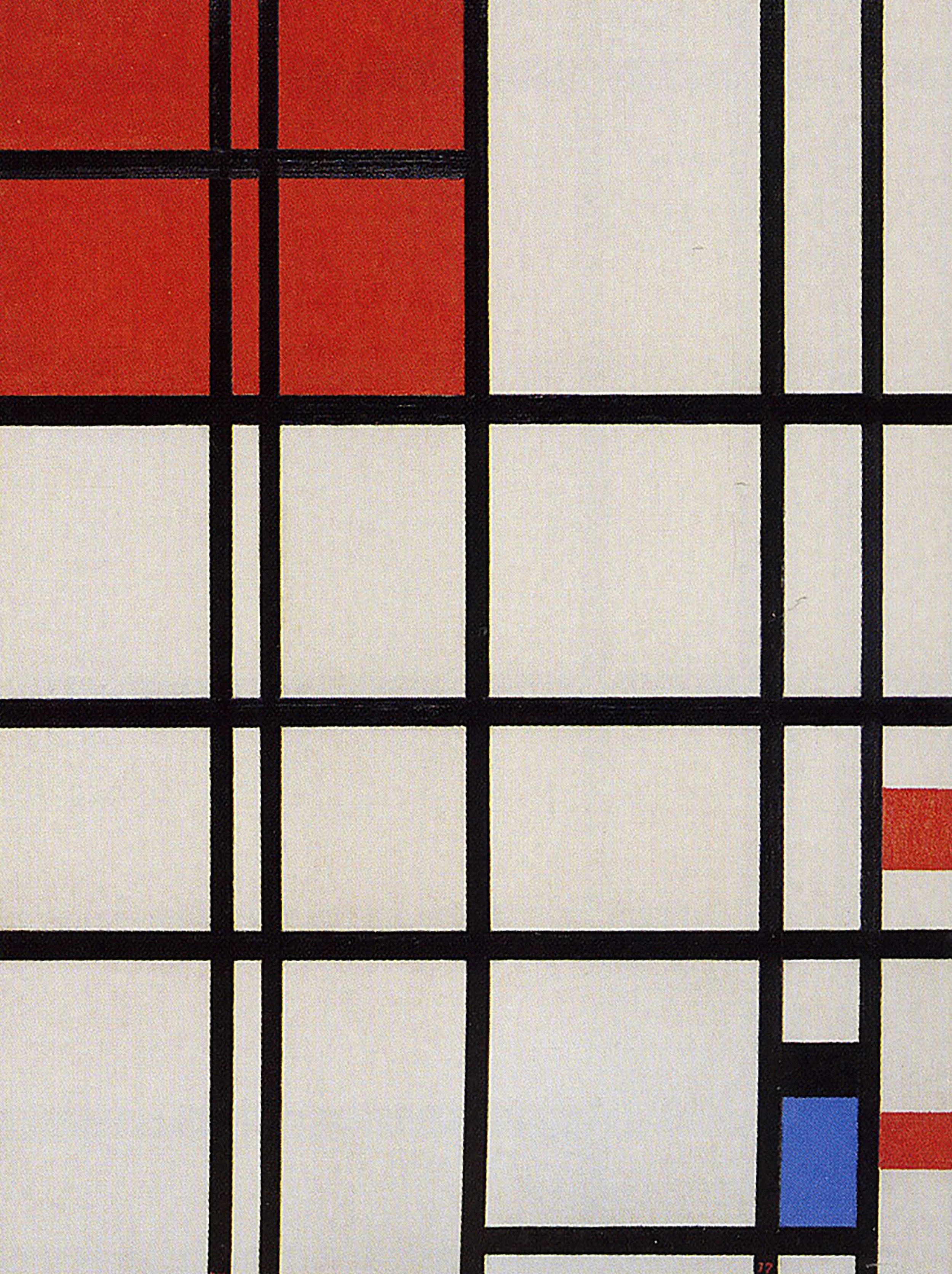
Piet Mondrian
No. 7
1937-1942
Museum Purchase, 54.7
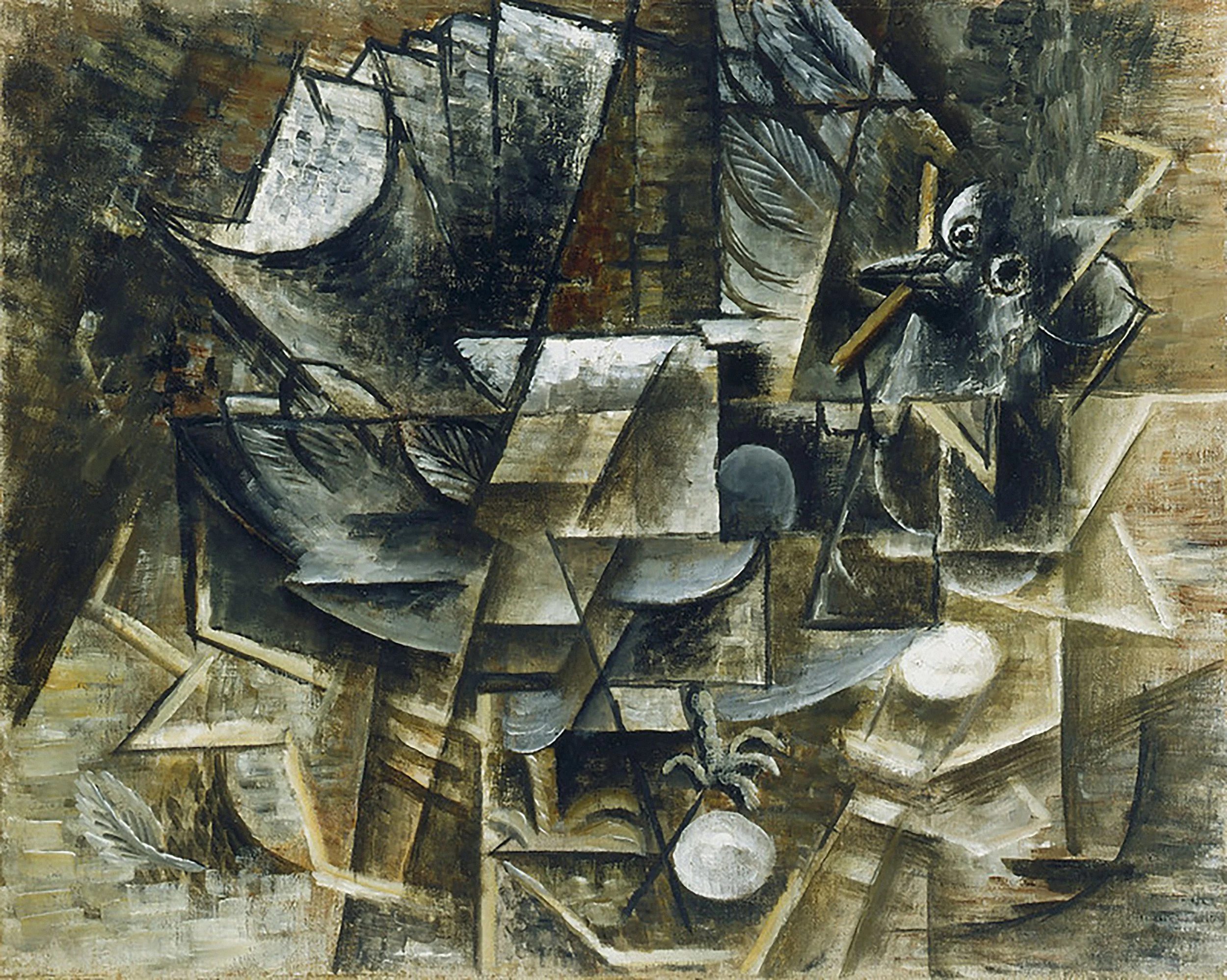
Pablo Picasso
Pigeon dans son nid et oeufs (Pigeon in Nest with Eggs)
1912
Museum Purchase, 53.210

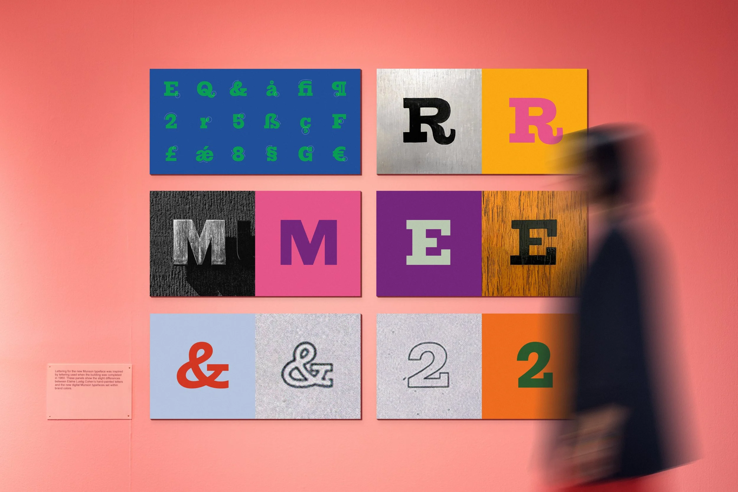
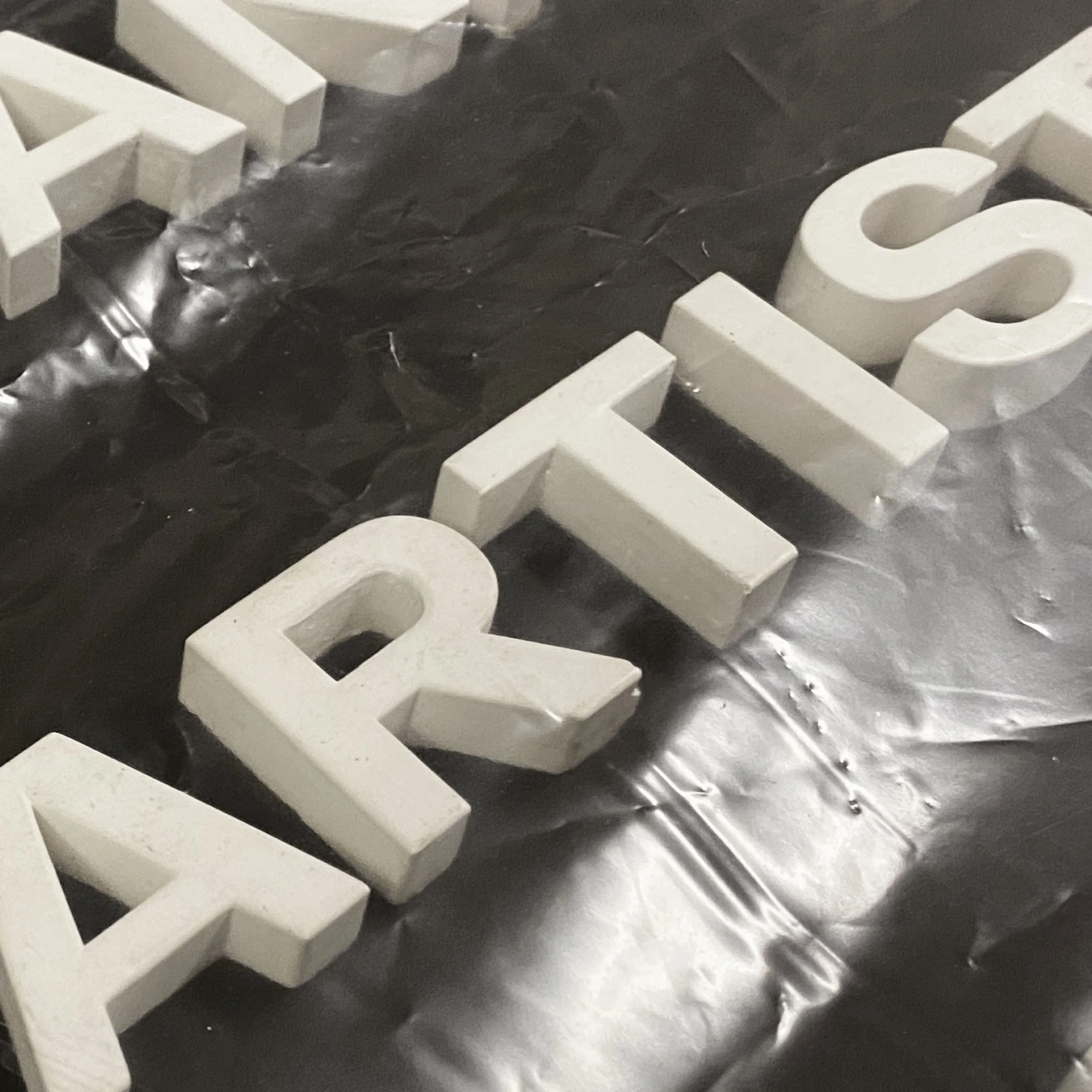
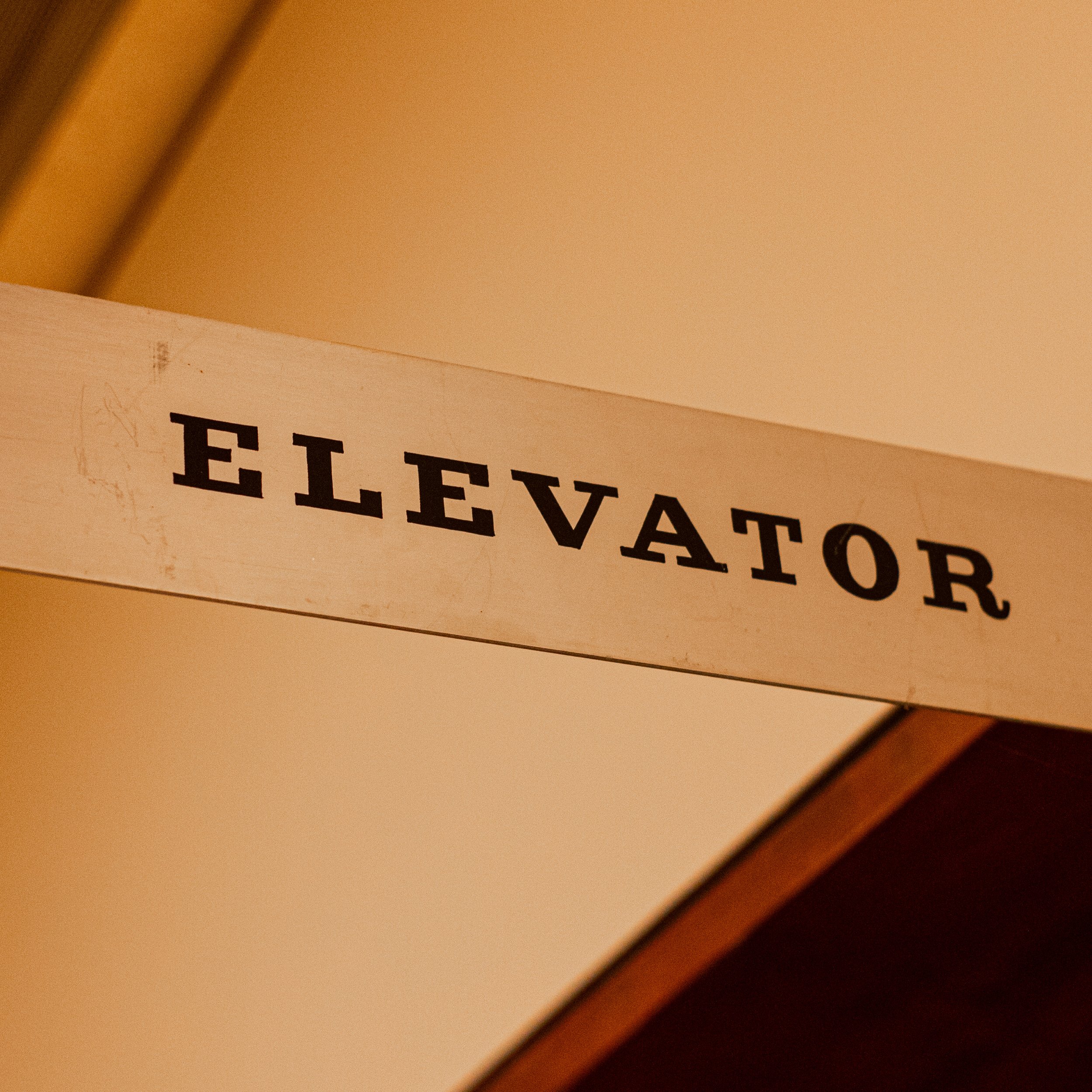
During the discovery and research phase, we uncovered a series of hand-painted or custom typography in signage and materials throughout the Museum.

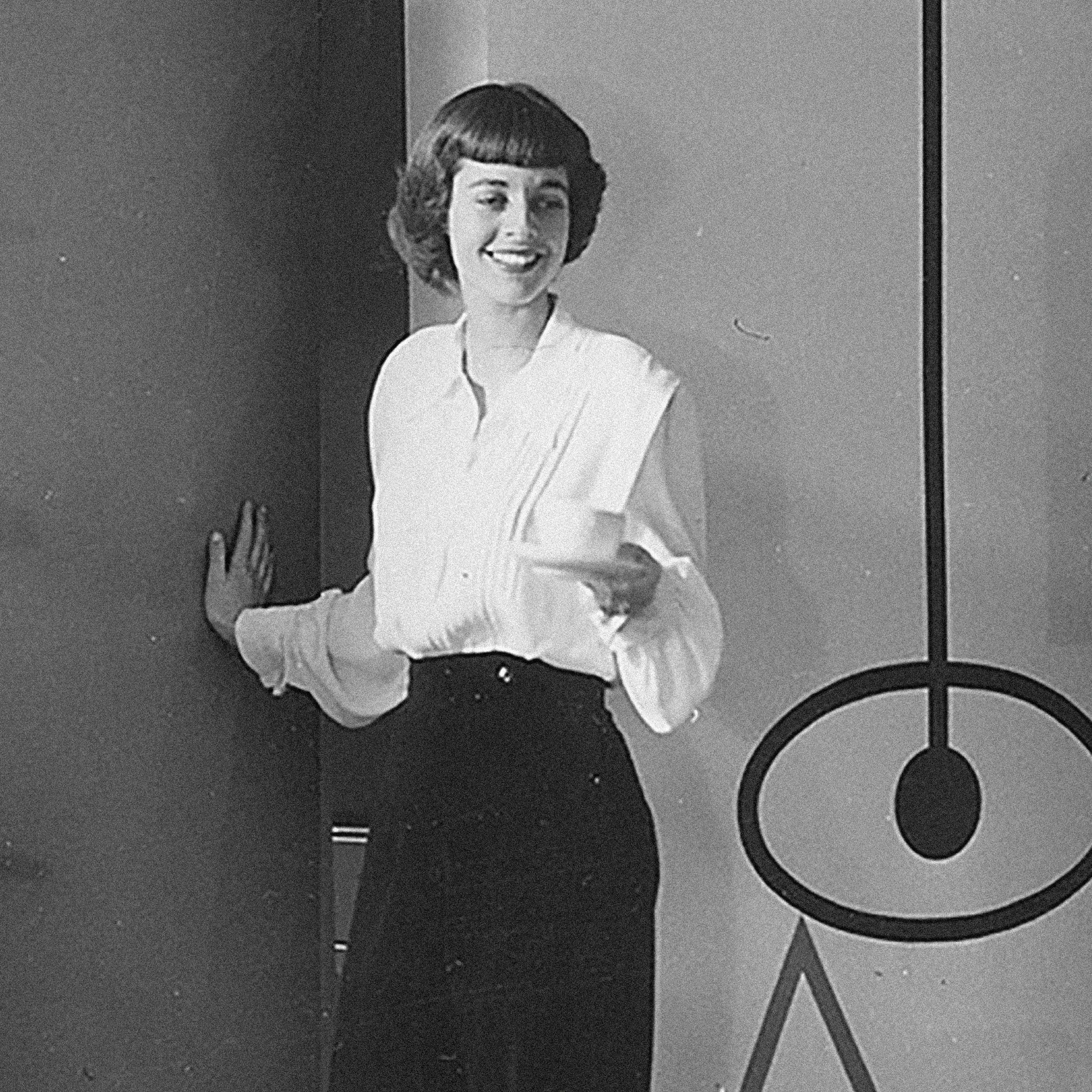
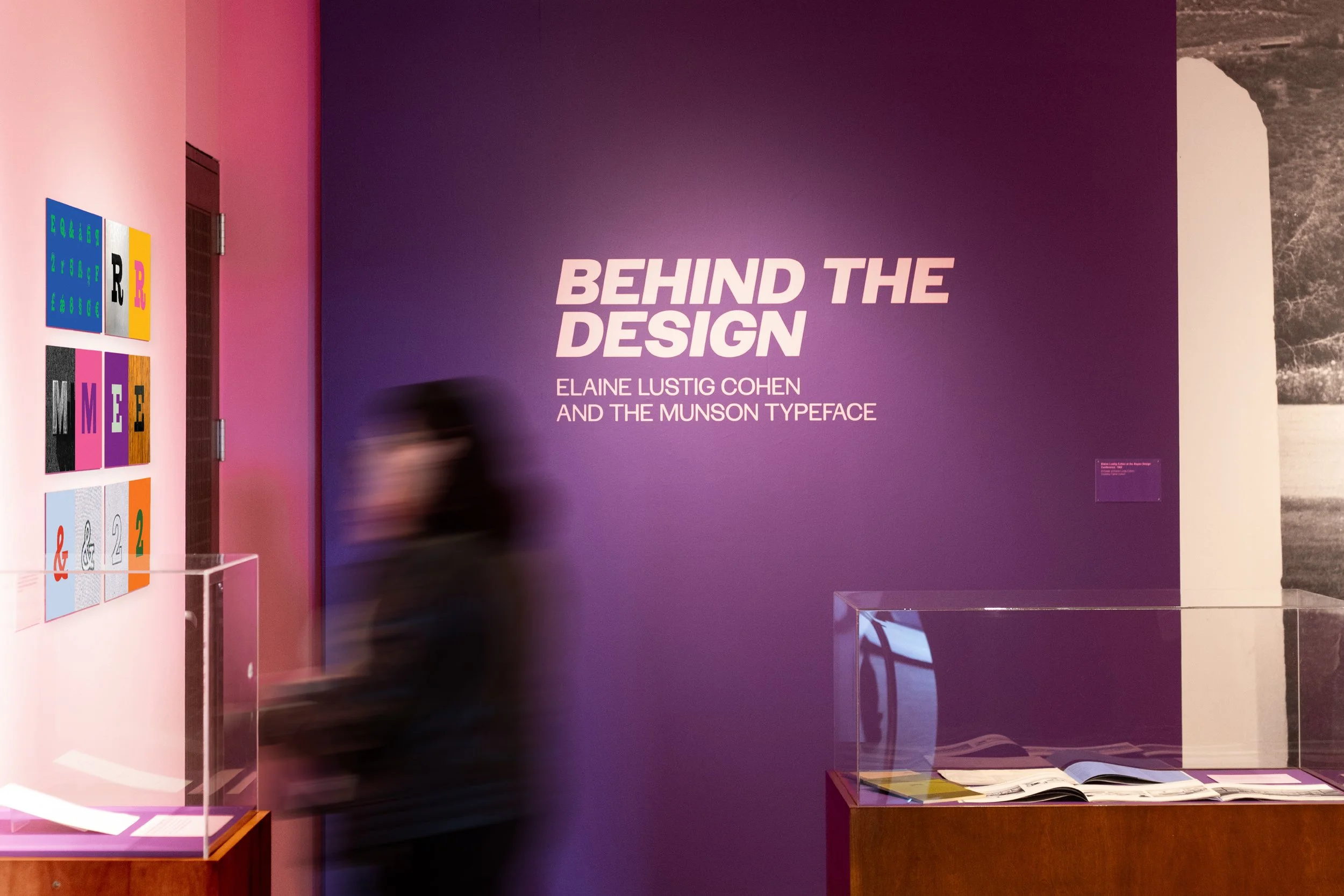
The Museum’s distinct typography was discovered to be drawn by Elaine Lustig Cohen. Cohen was a prolific typographic designer who first started her own studio in 1956.
Among her design career, she was well known for her hand-drawn signage and lettering projects.


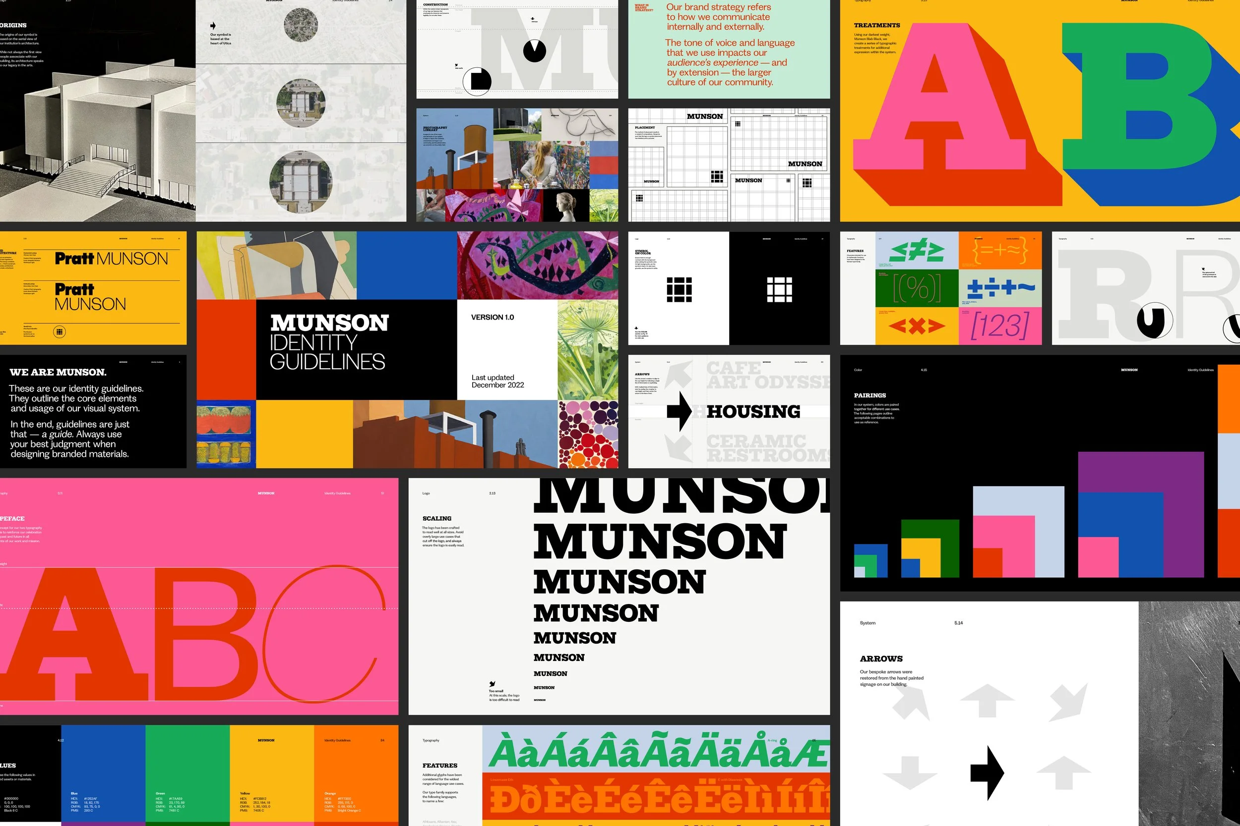
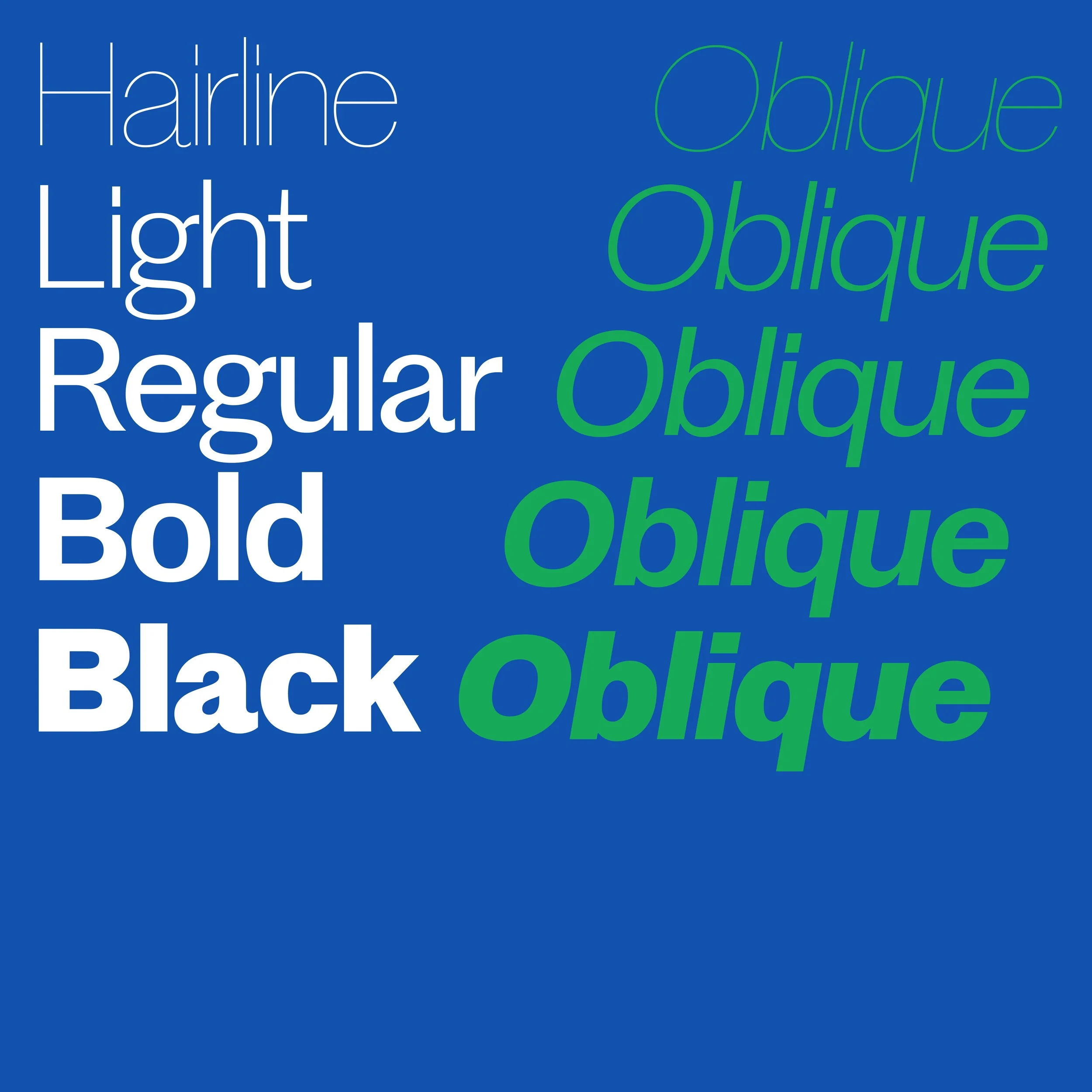
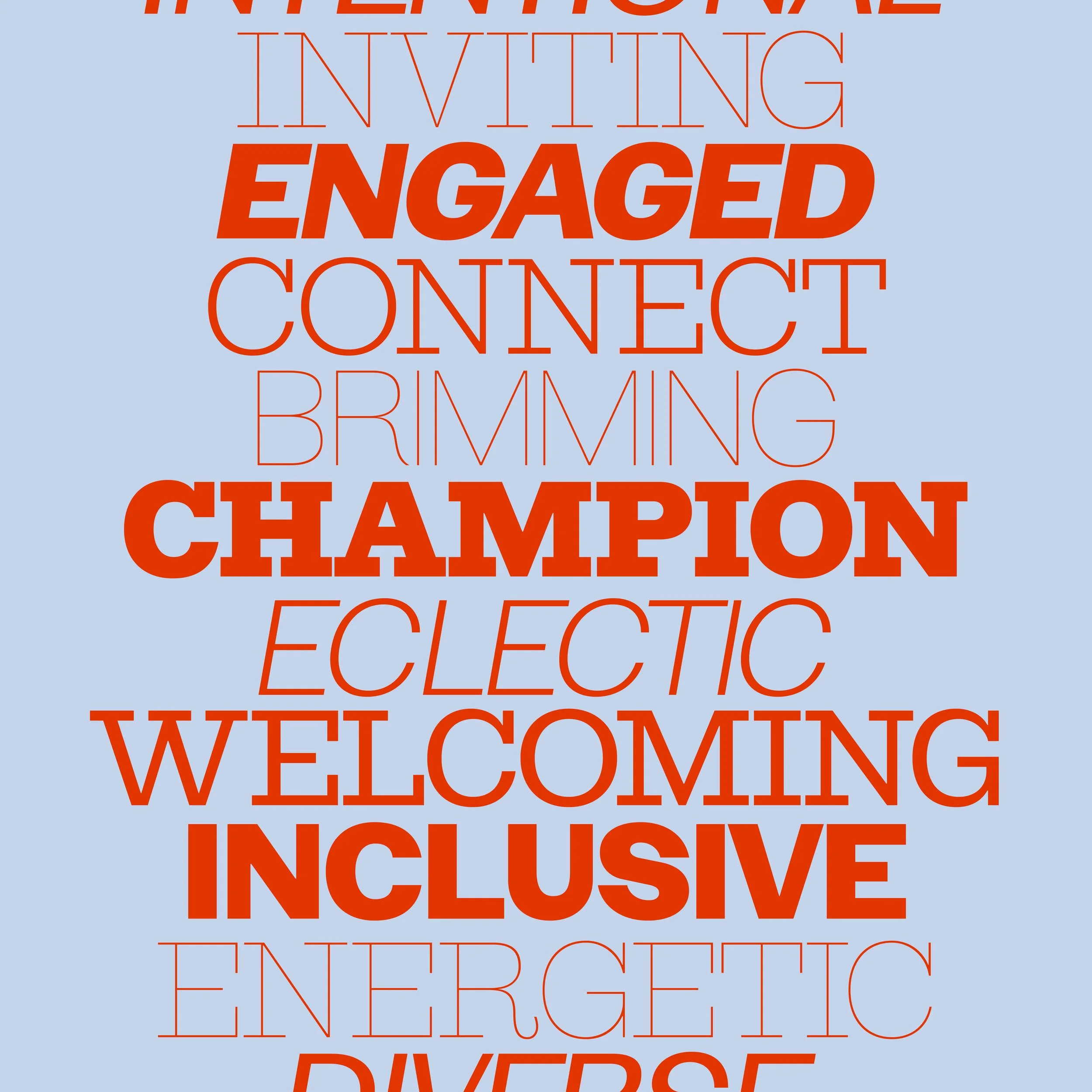
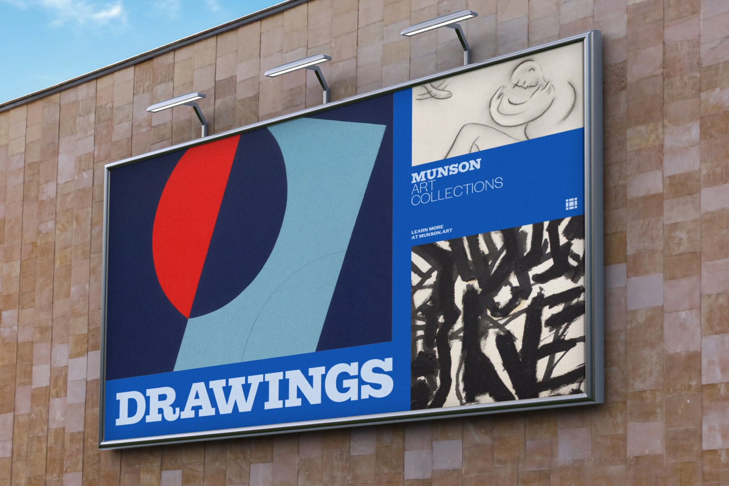
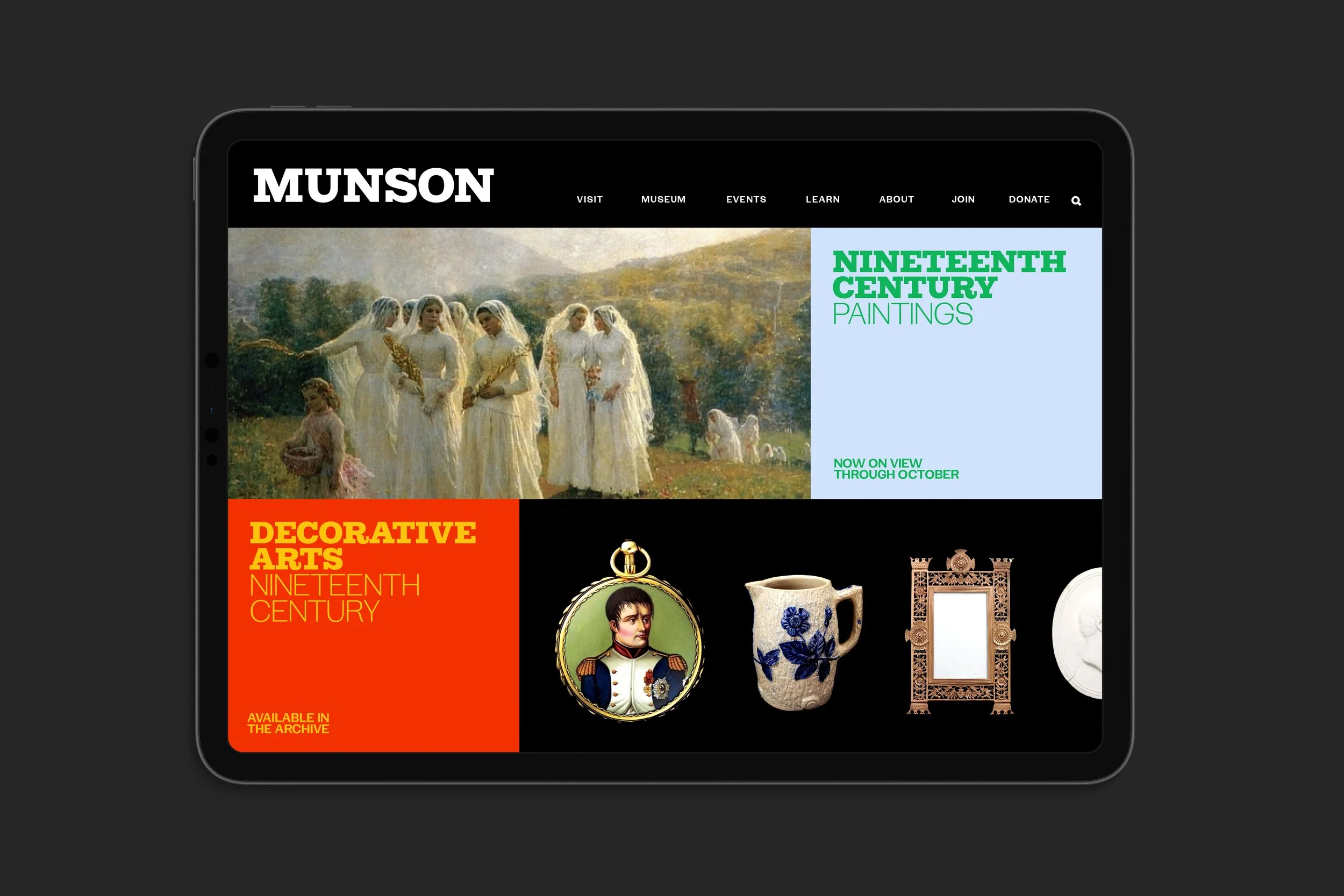
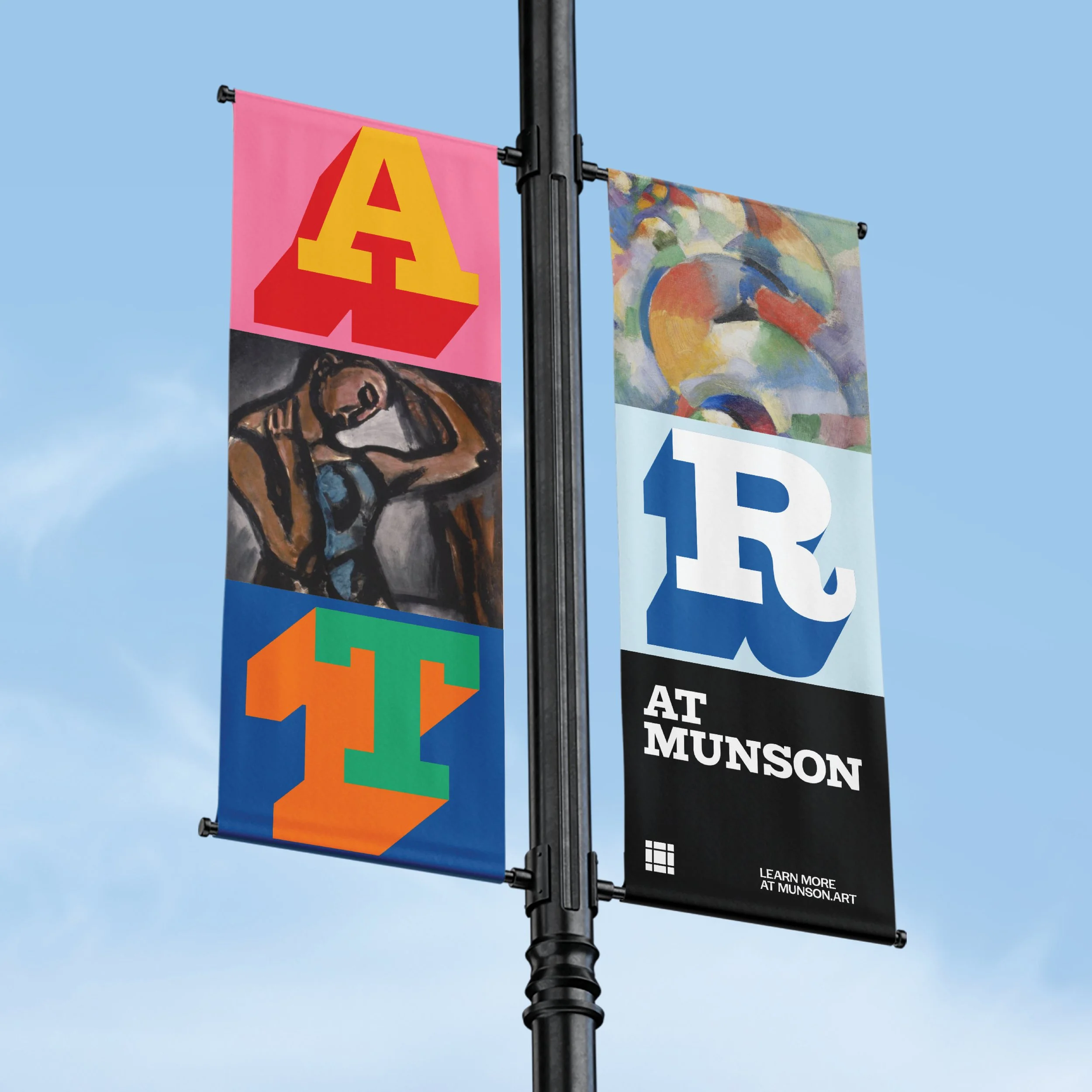
Using two distinct typographic styles as the foundation of the identity, the tools bridge the past and future of the Museum’s work and mission.
The palette was designed in reference to the historic use of vibrant pairings in the Museum’s long-standing publication of the Bulletin.
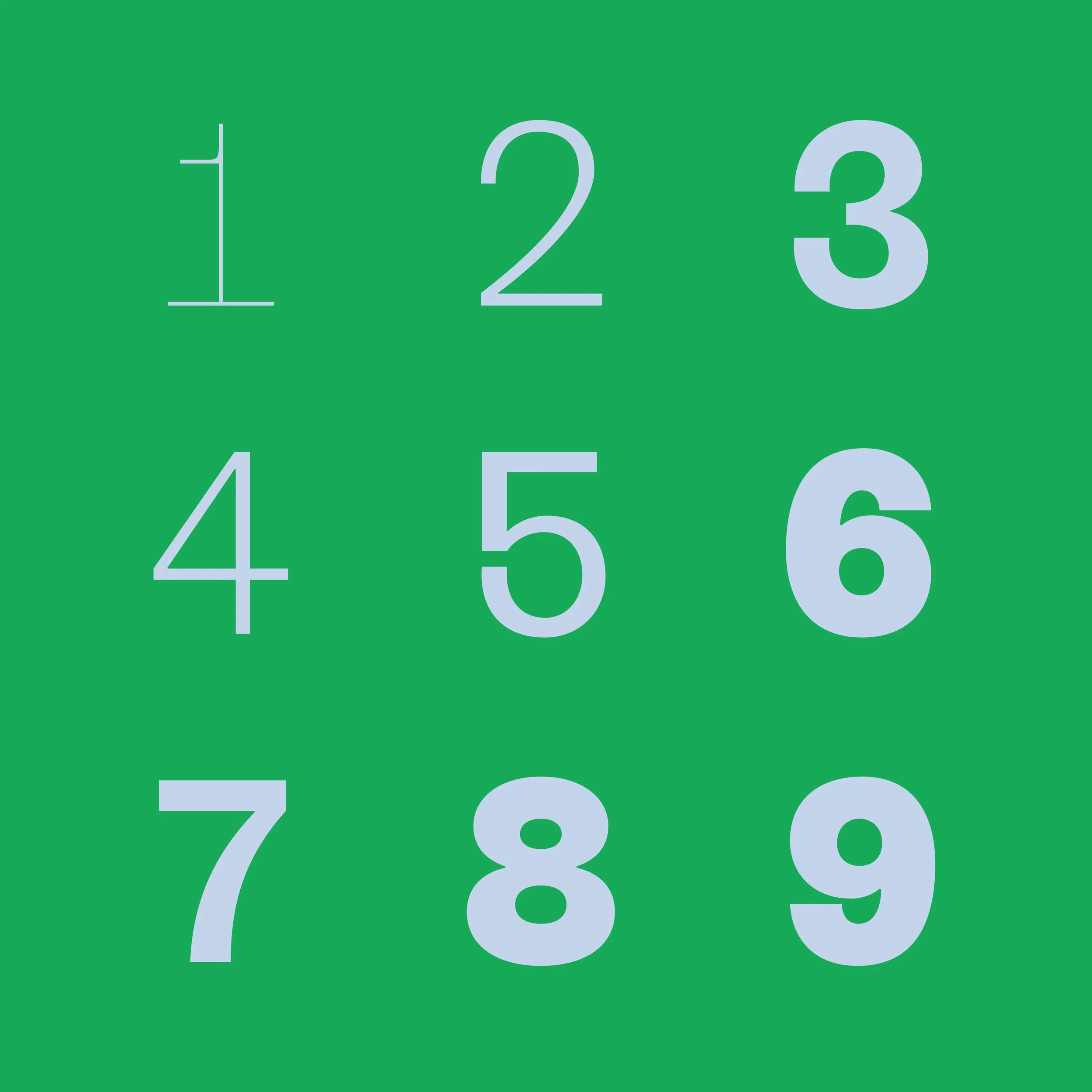
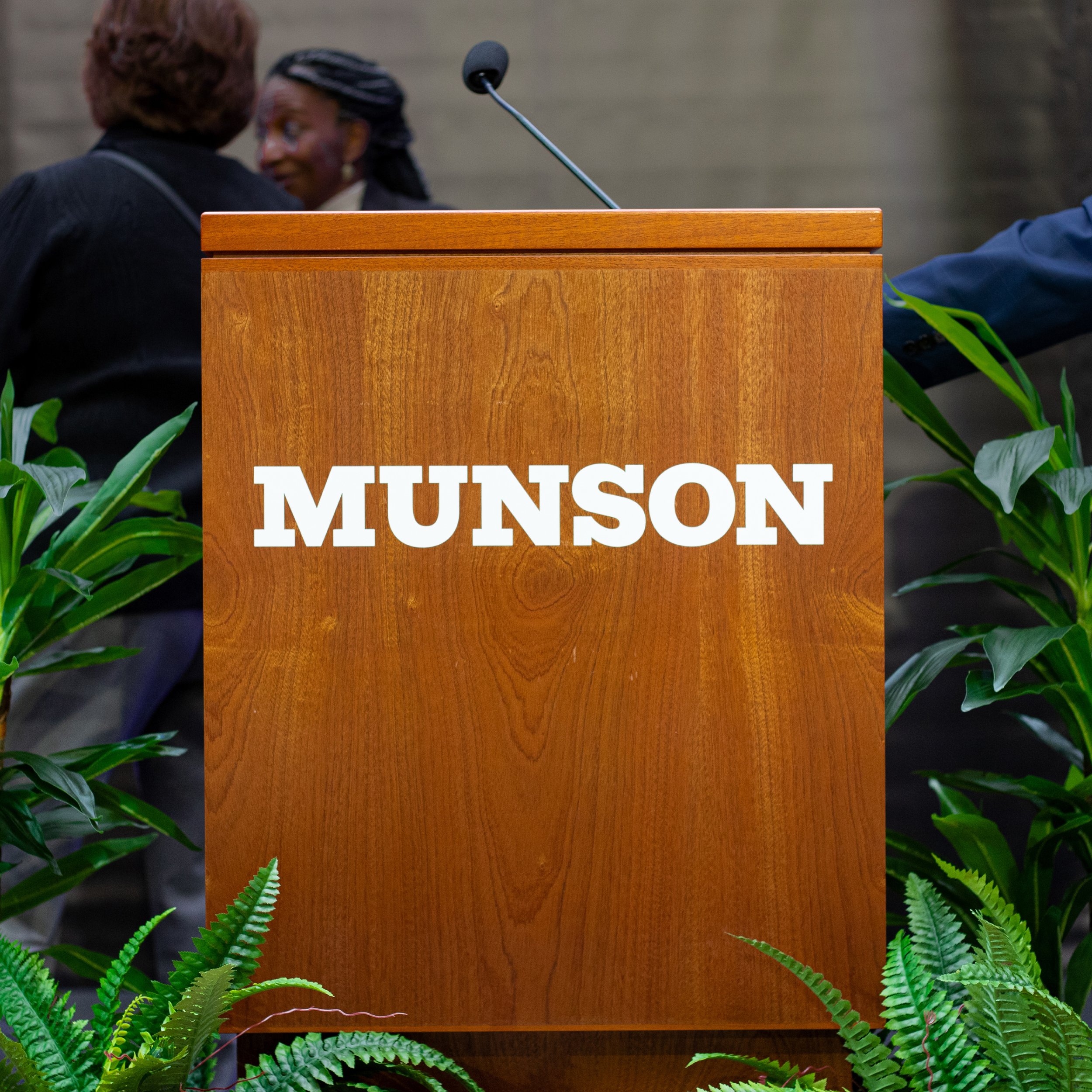
Munson Slab, Munson Grotesque, and Munson Grotesque Oblique comprise the type families for the brand.
Typefaces drawn by Emily Atwood→, and mastered by Tiny Type Co.→


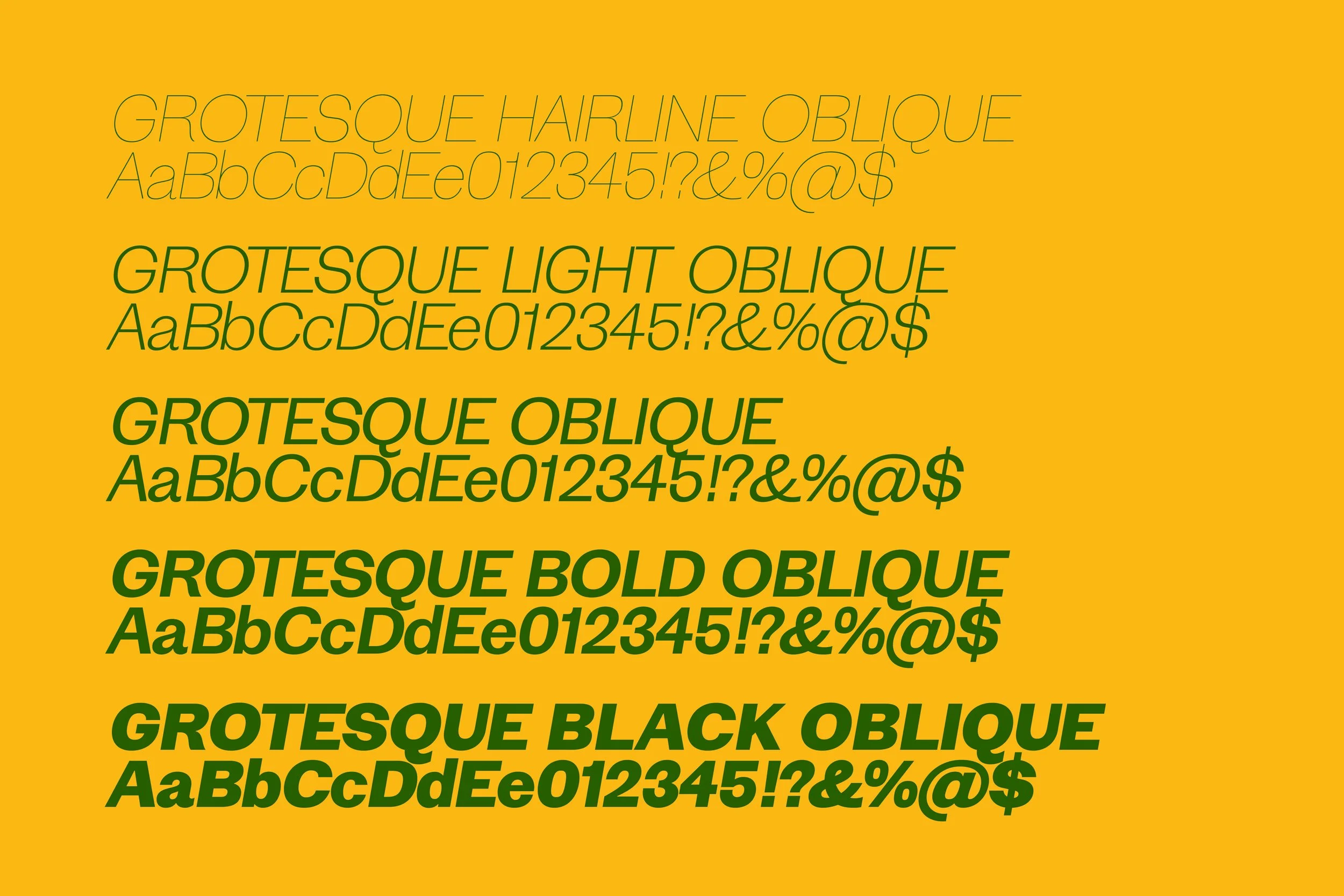
Each weight and style is designated with specific use cases to ensure consistent use of the type family across applications.

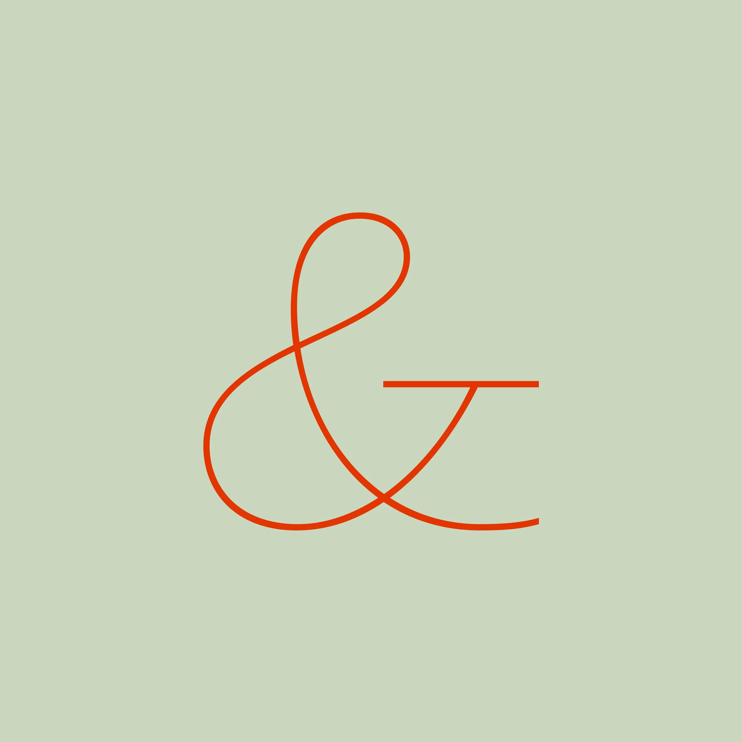


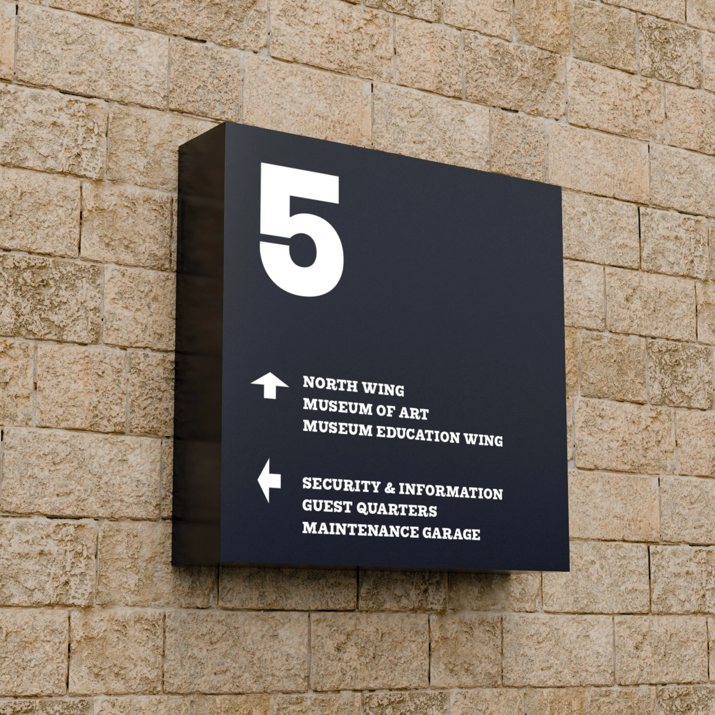
The signature modular construction of the Museum is used to design the Munson symbol.

The modular structure of the symbol is carried through to the system grid.
The simple approach to layout allows for flexible designs and the art to allows remain at the focus.


Pratt Munson College of Art and Design is the college program offered at Munson through its affiliation with Pratt Institute in Brooklyn.
The lockup combines the identifiers — Pratt’s wordmark, Munson’s secondary architecture styling, and yellow as an identifying color — to create a shorthand.


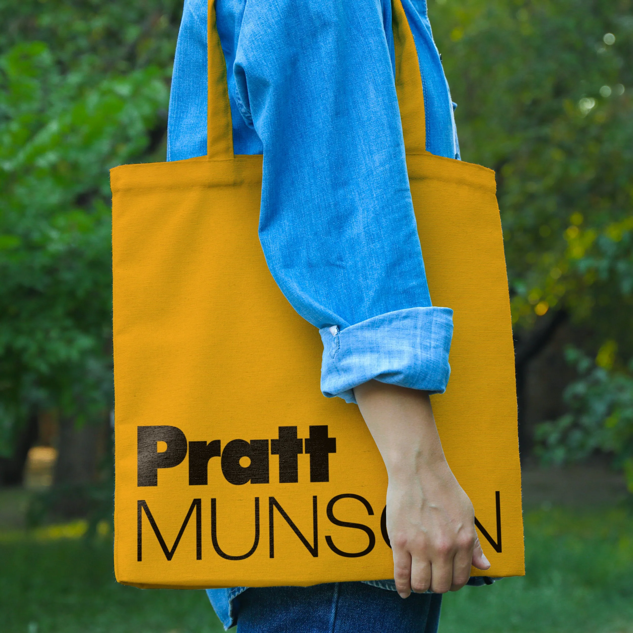

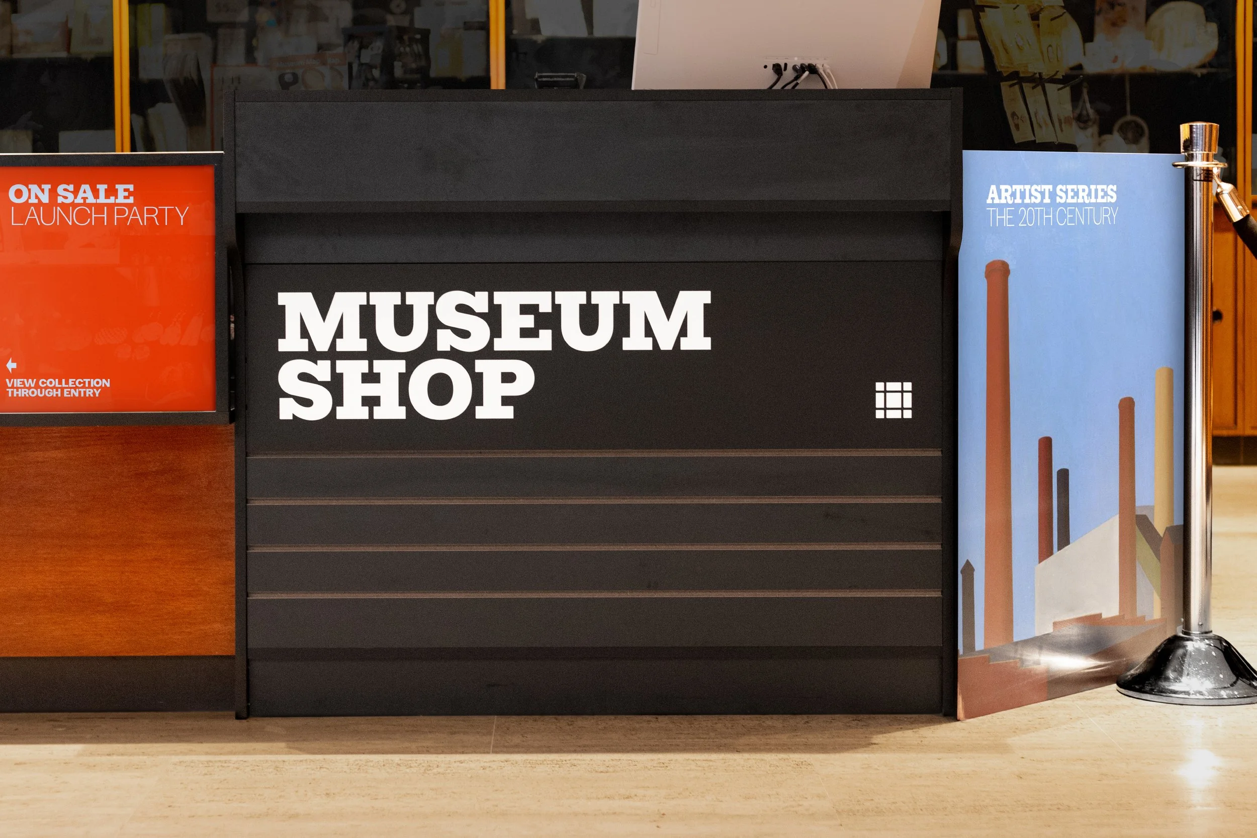
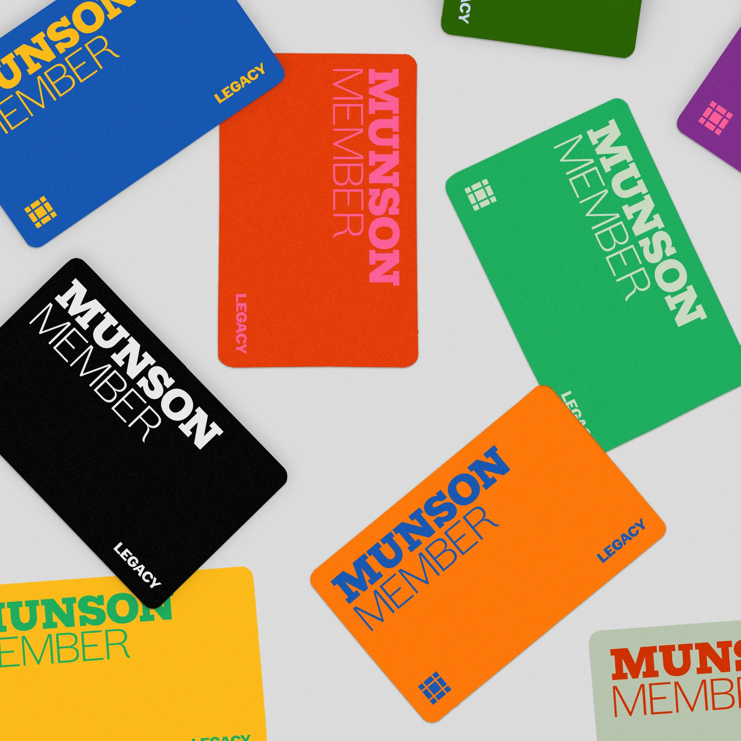
At the announcement of the new identity at the Museum’s launch party, merchandise for the brand refresh was distributed through the Museum Shop.
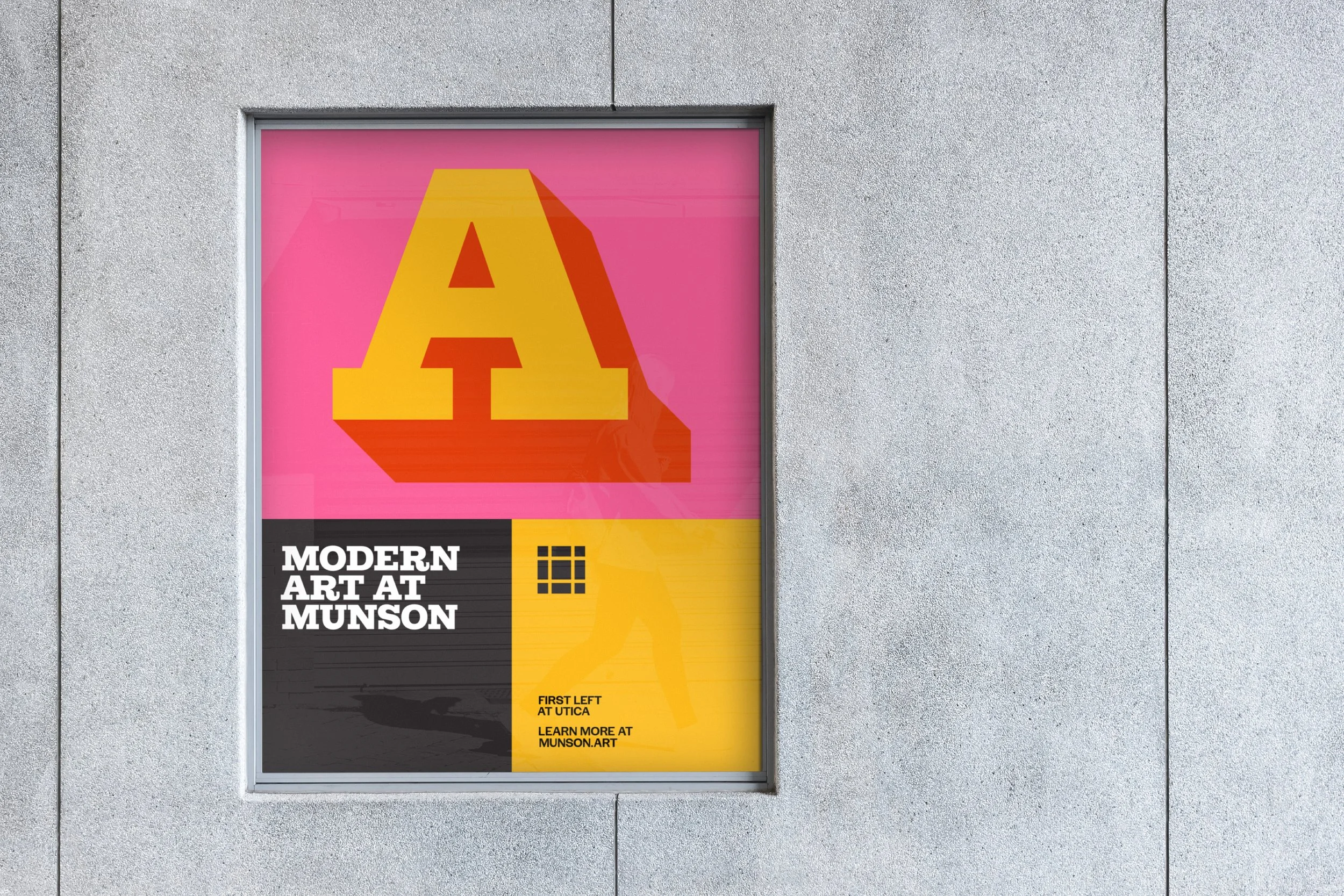
Using the darkest weight, Munson Slab Black, a series of typographic treatments for additional expression within the system can be created.

Alongside the launch event, a dedicated exhibit to Elaine Lustig Cohen’s hand-drawn typography that inspired the brand’s primary typographic voice was featured.